Hey guys,
So, I just wanted to take this opportunity to apologise for the confusion and annoyance caused to you all, (especially the lovely people who regularly visit this blog). I know it's a pain in the backside, but I'm trying hard to get it to look 'right' ASAP.
If only I could work out what I actually want it to look like...
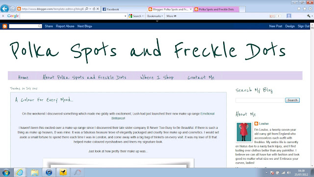
I began redesigning late last night thinking I wanted something white, crisp, and fresh looking. I created the above.
But I wasn't sure if the all-white layout was too harsh and too boring, so I added in a little pastel colour...
And again... I couldn't decide if I liked the layout, but still wanting to keep the colour scheme fresh-looking I tried changing my all-white background to pale grey polka dots, but kept the post and footer backgrounds white.
This is the layout I've currently paused on.
I can't decide if I like it, but I think I do. And of course, the polka dot background relates to the blog name.
I also considered two other backgrounds...
Which ever design I decide on I'll probably design a new header.
What I want to know is your opinion. Do you like my current layout/colour scheme? Is it too boring? Is it easy to read and navigate?
Do you have a favourite out of the screen caps above?
And, do you prefer to see colourful and patterned layouts, or plain crisp white designs when reading personal style blogs?
Any opinions would be appreciated!


I like the way it looks now, with the small polka dots, but my favorite screen cap is the second from the bottom. The font is cute, too! :)
ReplyDeleteI was leaning towards that one actually, but as you can see I've changed it again!
DeleteI like the white background the best :) x
ReplyDeleteThank you Celia.
DeleteI love the last one xx
ReplyDeleteEveryone's given a different answer! LOL. I did like that one too, but I've changed it again! xx
Deletei actually really like the current layout, it's very fresh and pro. it might look cute with mint polka dots too xxx
ReplyDeleteThanks Hannah. I've changed it again to Cath Kidston florals, though! xx
Delete